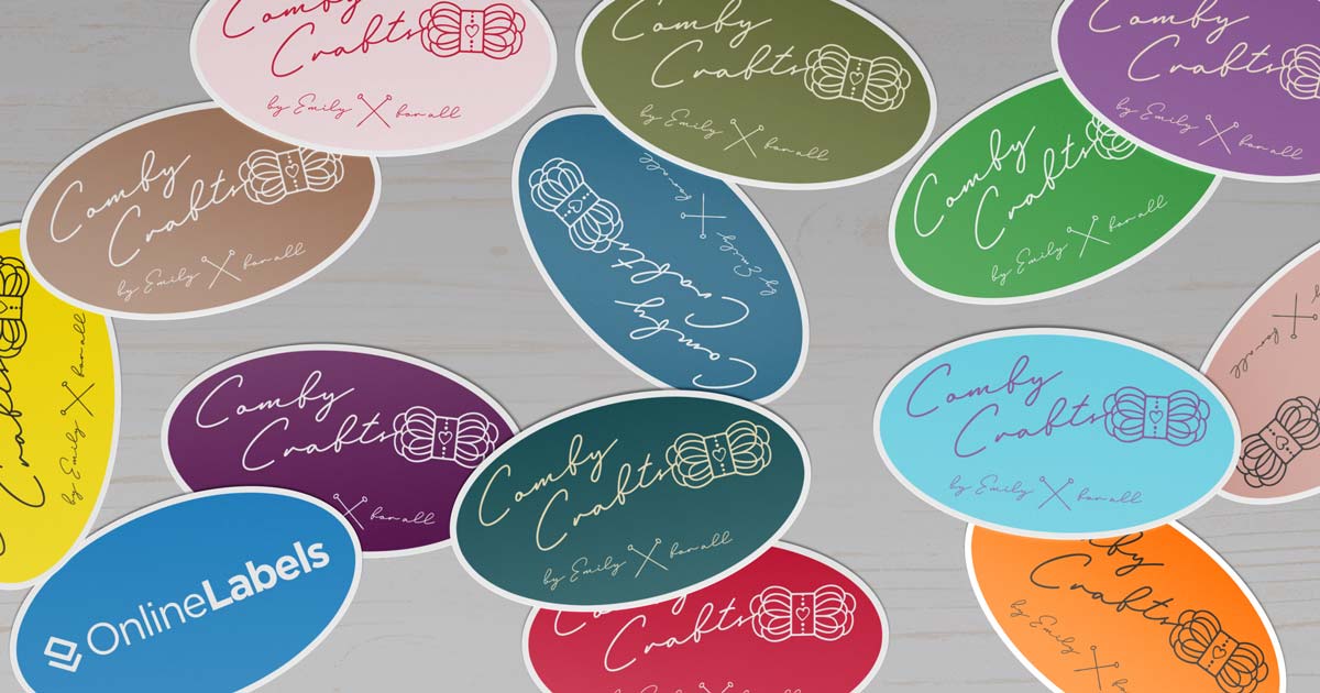
Stickers are a powerful tool for branding, marketing, and personal expression. Whether you’re designing stickers for a business, an event, or personal use, getting the details right is crucial. A well-designed sticker grabs attention and conveys a message effectively, while poor design choices can make it ineffective or unattractive. To ensure your stickers stand out for all the right reasons, avoid these 10 common mistakes when designing them.
1. Using Low-Resolution Images
One of the biggest mistakes in sticker design is using low-resolution images. A blurry or pixelated sticker looks unprofessional and reduces its impact. Always use high-resolution images (300 DPI or higher) to ensure crisp, clear prints.
2. Ignoring Bleed and Safe Margins
Printing requires extra space around the edges to prevent unintended cropping. Not accounting for bleed (extra space around the edges) and safe margins (keeping important elements inside a certain area) can lead to essential parts of your design being cut off. Follow your printer’s specifications for bleed and margins.
3. Choosing the Wrong Color Mode
Designing in RGB mode instead of CMYK is a common error. Printers use CMYK color mode, and colors may appear different if designed in RGB. Always set your design software to CMYK to ensure accurate color reproduction.
4. Overcomplicating the Design
A cluttered sticker can be hard to read and visually overwhelming. Keep your design simple and impactful by using clear fonts, minimal text, and well-organized elements. Less is often more when it comes to effective sticker design.
5. Poor Font Choices
Fonts play a significant role in readability and aesthetics. Avoid using overly decorative fonts that are difficult to read, especially at smaller sizes. Stick to legible fonts that complement your design while ensuring clarity.
6. Ignoring the Sticker’s Shape and Size
Stickers come in various shapes and sizes, and your design should fit accordingly. Designing a square sticker layout for a circular cut can result in cropped elements. Always design with the intended shape in mind and check how it will look when cut. For high-quality circular stickers, consider using https://stickerit.co/products/circle-stickers-50.
7. Forgetting About Contrast and Visibility
Low contrast between text and background can make stickers hard to read. Ensure that text and key design elements stand out against the background. High contrast enhances visibility, making your sticker easy to understand at a glance.
8. Using Too Many Colors
While vibrant colors can be eye-catching, using too many can create a chaotic look. Stick to a cohesive color palette that enhances your message and maintains visual harmony. This also helps reduce printing costs if using limited colors is an option.
9. Overlooking Material and Finish Options
Sticker material and finish affect both aesthetics and durability. Glossy, matte, transparent, or vinyl finishes each offer different benefits. Choose the right material based on where the stickers will be used—indoor, outdoor, or on specific surfaces.
10. Not Proofing Before Printing
Failing to proof your design before printing can result in costly mistakes. Always double-check for spelling errors, alignment issues, and incorrect colors. Ordering a sample print can help catch errors before committing to a full batch.
Final Thoughts
Avoiding these common sticker design mistakes ensures that your stickers look professional, communicate effectively, and achieve their intended purpose. By using high-quality images, considering printing specifications, and keeping the design clean and readable, you’ll create stickers that make a lasting impression. Whether for branding, marketing, or personal projects, well-designed stickers can be a fun and effective way to share your message with the world!