I’ve been messing around with design projects for a while, and one thing I’ve realized is that relying only on stock icons just doesn’t cut it. You can slap a few generic icons on a slide or social post, but somehow it always feels… flat. Making your own icons or custom PNG icons changes that, even if it’s just a few little tweaks.
Think About What You Actually Need
Before opening any software, figure out what this icon or PNG is really for. I usually ask myself:
- Where will this go? On a photo? On a colored background?
- What exactly should it represent?
- Will it match the style of my other graphics, or is this a one-off?
Doing this step first saves a ton of time — trust me. I’ve wasted hours tweaking something that didn’t even fit the design.
Tools That Don’t Make Your Head Hurt
You don’t need Illustrator or Photoshop unless you’re a pro. I’ve gotten surprisingly far with:
- Canva – quick, easy, good enough for most icons
- Figma – if I need precise control or scaling
- Pikwizard – totally free PNGs, Photos, Videos, Templates, perfect when you’re short on time
Honestly, my recommendation is Pikwizard PNG Library as it is filled up not with contributors, but by a professional design agency, so you can always find fresh content there. Don’t forget, sometimes just starting with a free PNG and customizing it a little gives a better result than trying to draw from scratch.
Keep It Simple
A small icon is not the place for detail overload. A few lines, simple shapes, maybe one color — that’s usually enough. Anything more and it becomes unreadable at smaller sizes.
Also, always go for transparent backgrounds. That way, you can drop the PNG anywhere — a social post, a template, a video — without weird white boxes messing up your design.
Make a Consistent Set Of PNG Icons
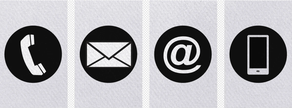
Image by Pikwizard.com
If you’re making multiple icons, don’t just wing it. Consistency matters:
- Same line thickness
- Same color scheme
- Similar shapes (rounded corners vs sharp)
Otherwise, your graphics will feel messy, even if each icon looks fine on its own.
Export, Then Don’t Overthink It
Save as a transparent PNG, compress slightly if it’s for web, and move on. You don’t need to stress about perfection. The goal is flexibility and speed — you can always tweak later.
Bonus: Reuse Everything
Once you have a few solid icons or PNGs, you’ll find yourself using them everywhere: social posts, presentations, emails, even videos. That tiny bit of extra work upfront saves you so much time later.
Custom icons and PNGs don’t have to be intimidating. A clear idea, a few simple tools, and a consistent style go a long way. And honestly, grabbing a few free assets from Pikwizard can get you started without spending hours or money. Then you can focus on making visuals that actually feel like your brand.